

Kit design is a routinely tricky area, and I think the truth might be that most Spurs fans are just looking for that perfect Lilywhite shirt that ticks all their boxes; one of which is no red logo – which in an age of ruthless marketing is a big sticking point.
One Spurs fab @thfcelso gathered these designs online in order to give Nike some hints, and I think he, or the people that made them are seriously onto something.
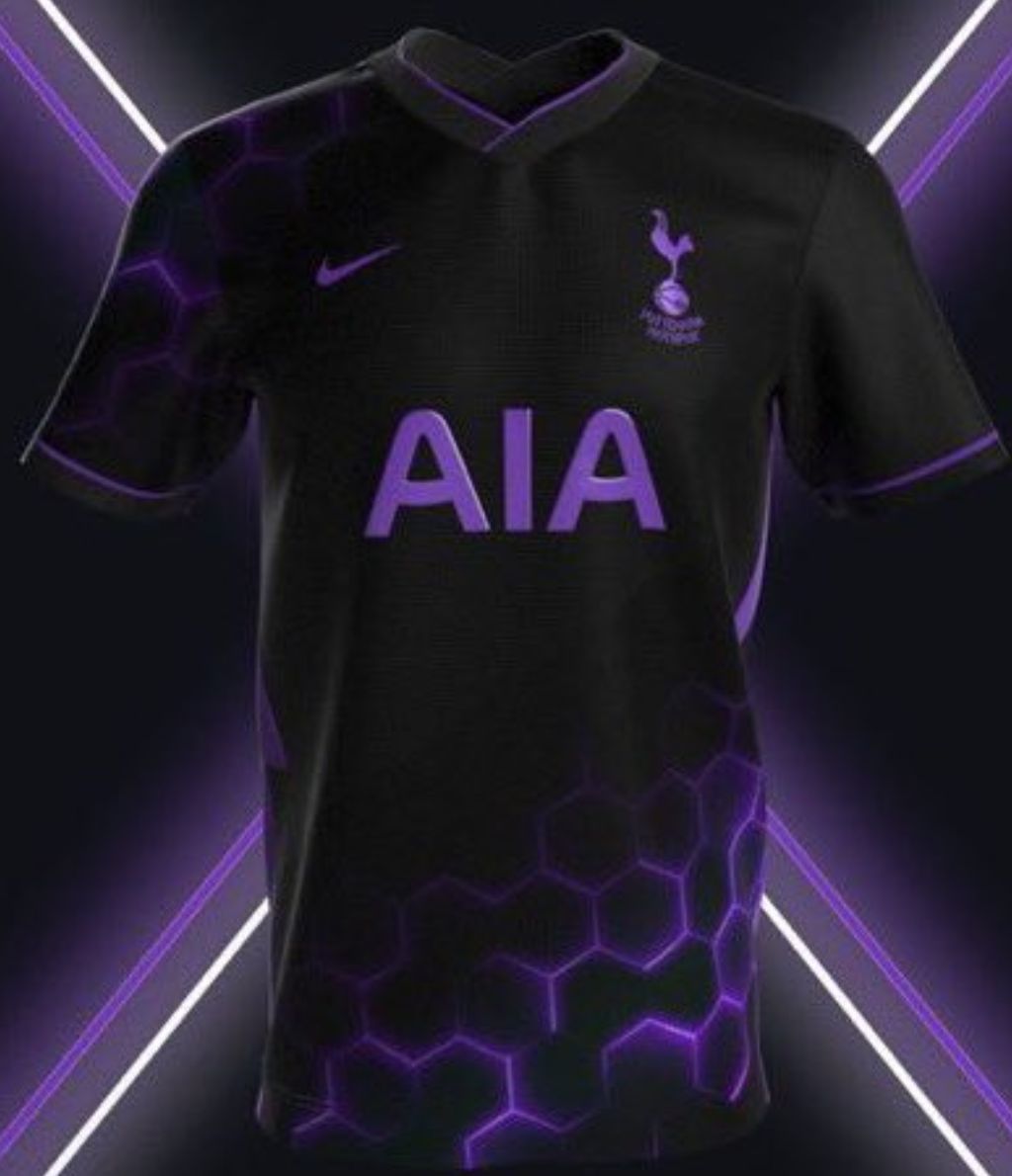
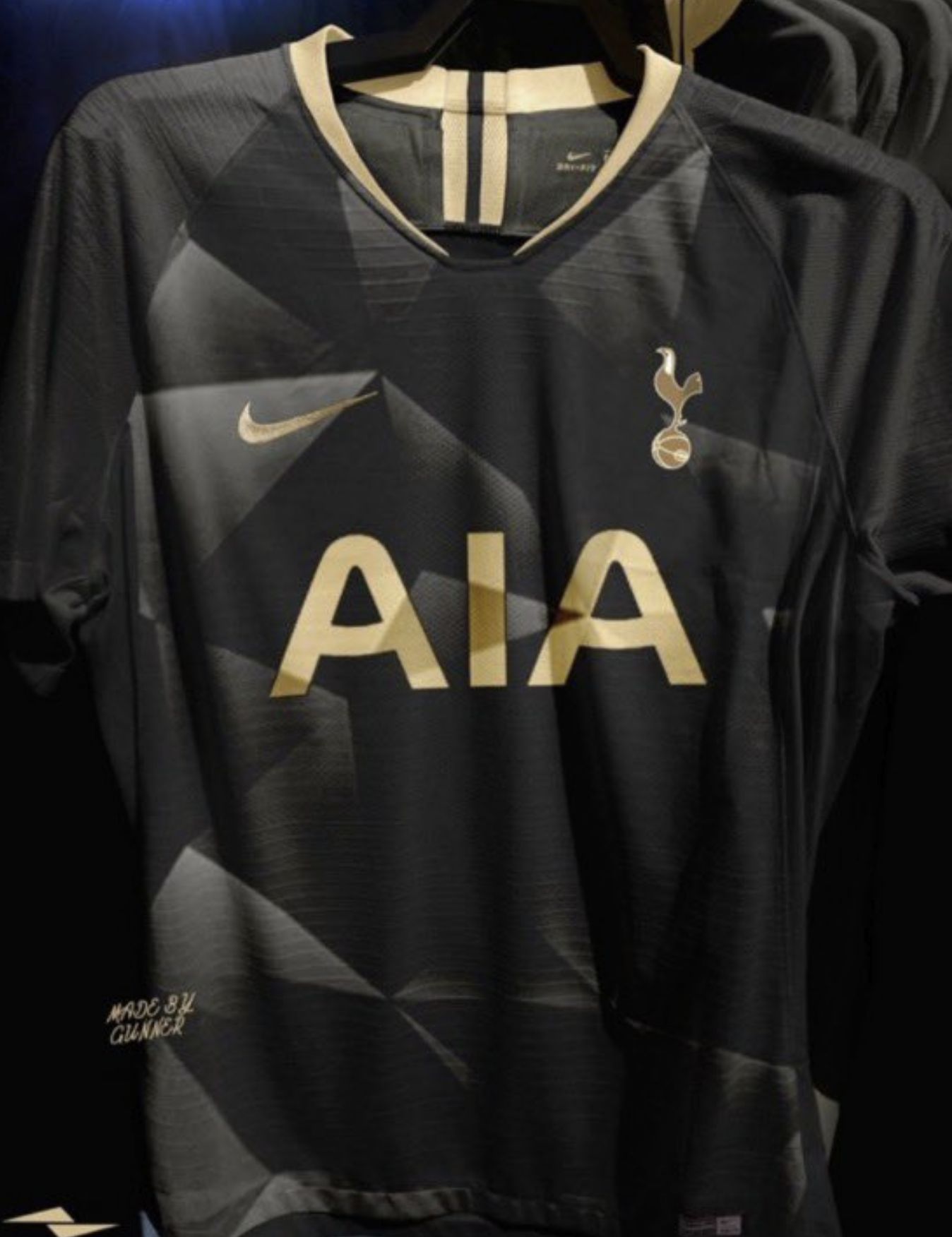
For me, none are poor, and the black and gold one would probably sell out.
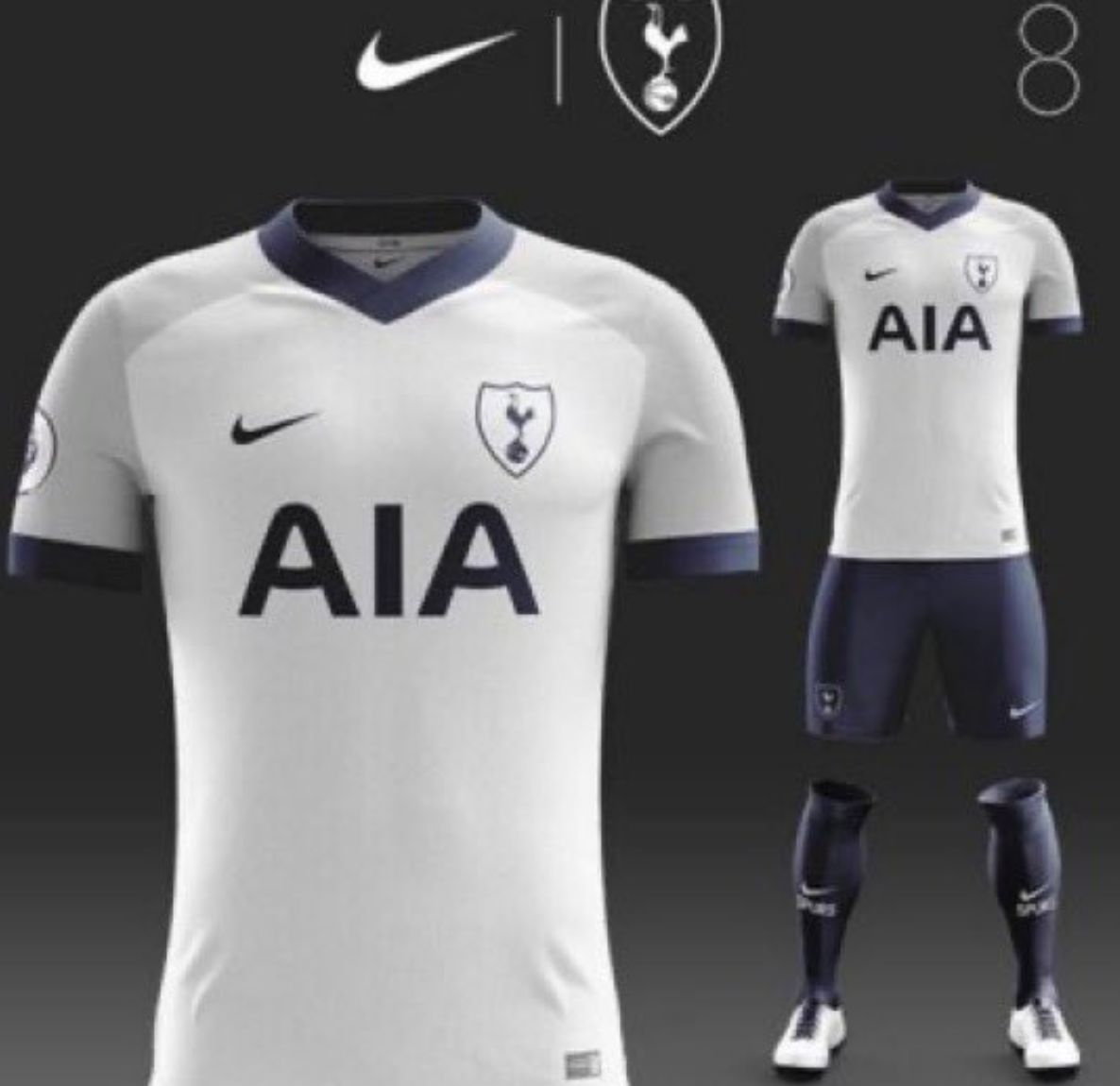


I like the white one
All white is for Europe.
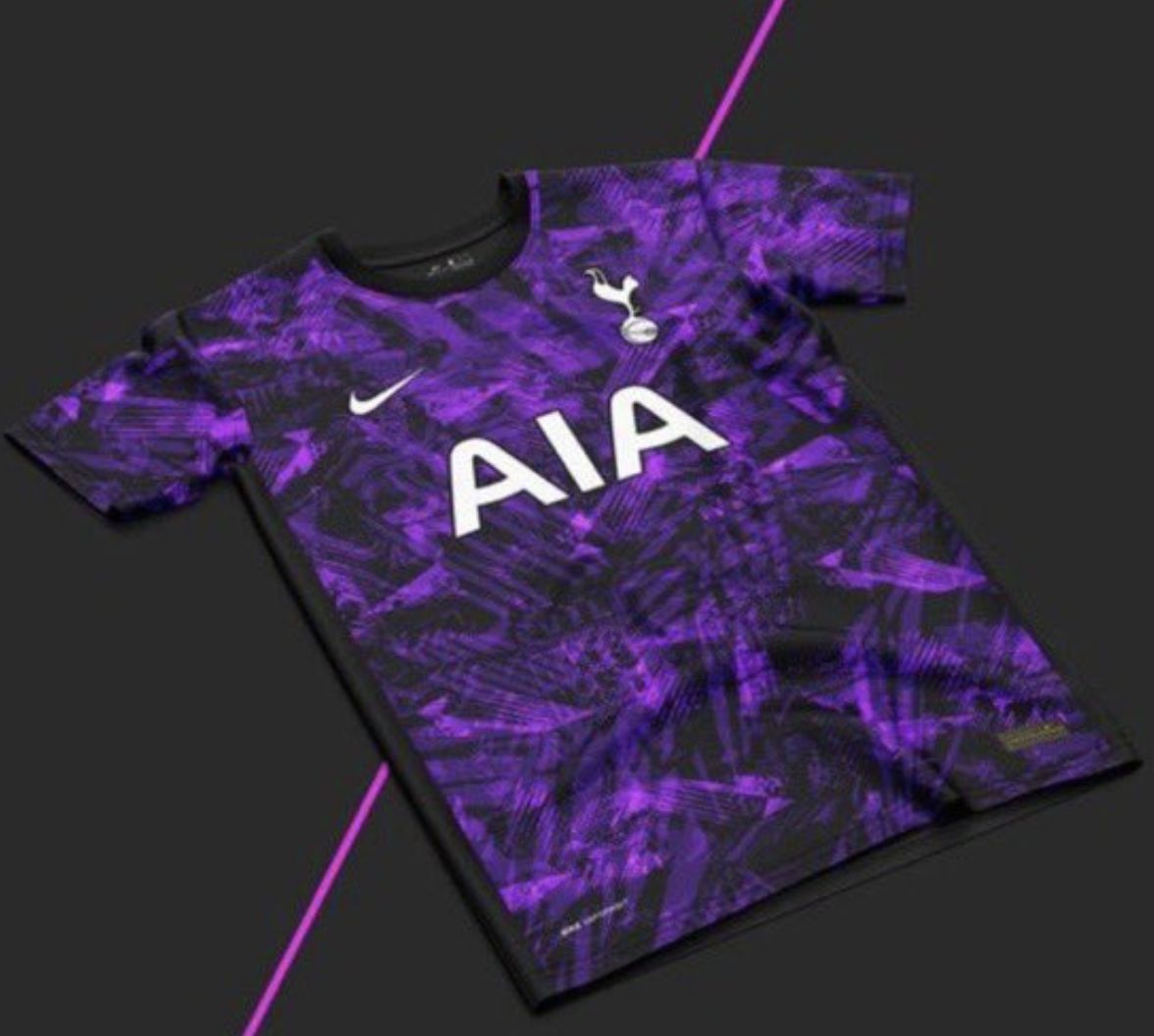
I think a tie-dye design would look better.
No matter what we wear the red AIA has to be the most horrible Logo ever.
I prefer the traditional white shirt for home matches but with white socks. I have also liked us in all-white strips at times. perhaps an all-white one with some blue edging on the shirt and shorts. Strange but my impression is we generally play better when wearing those colours.
Like the black and white kits , purple hmmmm not sure
Have a ganders at this website as the designs remind me of their style but not quite as way out
https://m.lightinthebox.com/en/c/men-s-3d-t-shirts_63113?_ga=2.121555722.364890722.1620893620-1006901251.1620893620&_gac=1.217301410.1620893621.EAIaIQobChMIwYeFoZvG8AIVk-vtCh3BVQ7YEAAYASAAEgI_u_D_BwE&is_module=0&prm=1-2.2.56.0
Not sure about ‘made by gunner’ being embroidered on there…
This is what you get when an adult not a 5 year old does design.