

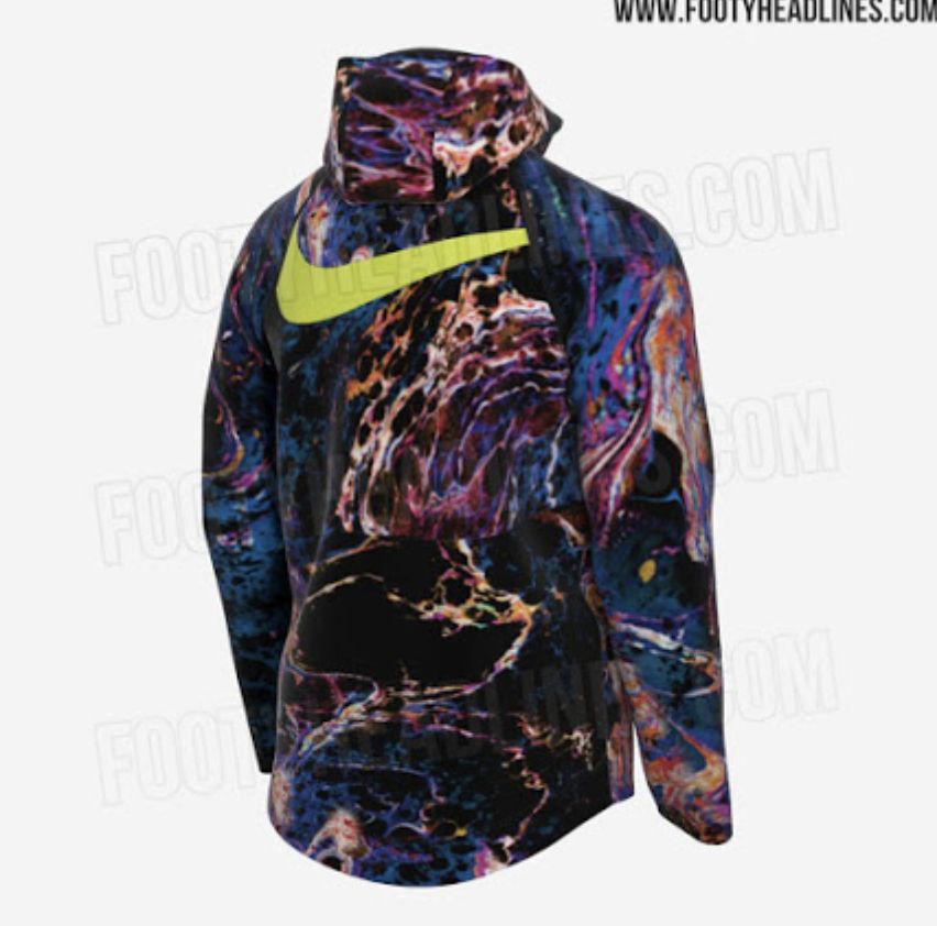
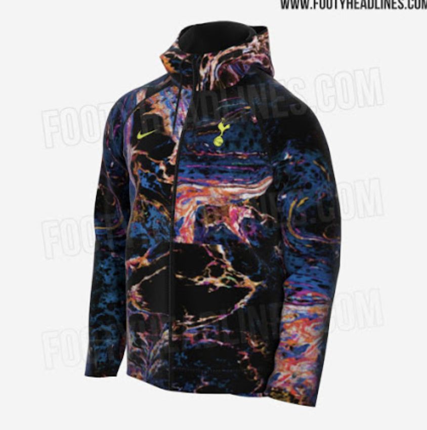
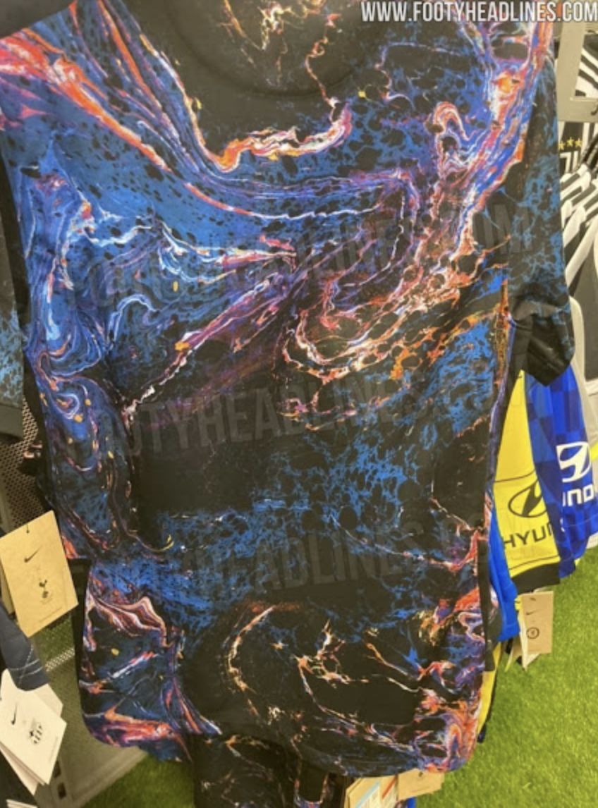
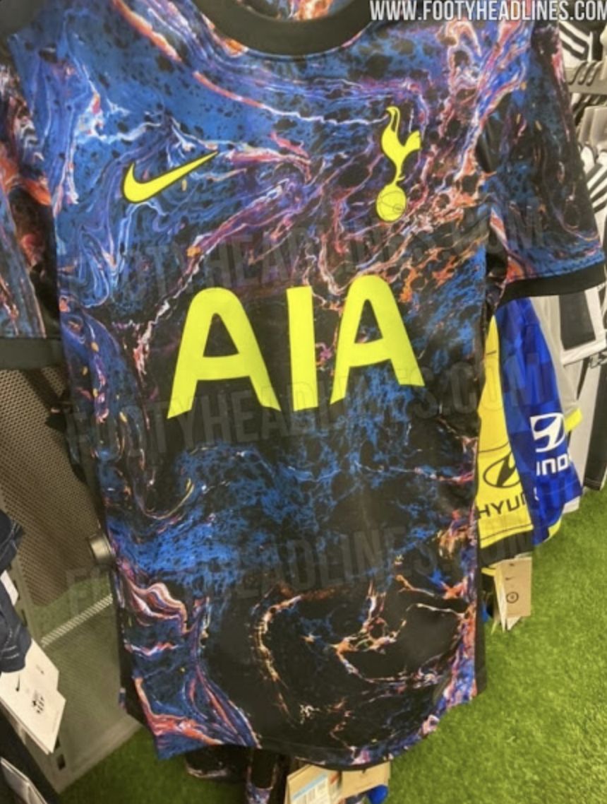
Footheadlines are here once again with some frankly astonishing images which are, by the looks of it, part of the club’s latest retail offering. Just how these will sell is anyone’s guess, but this is not a look I’d expect many to be in a hurry to adopt unless the rave scene is set to make a determined comeback, and even then…
What might we call this pattern, trip-hip camouflage, or Star Wars on ice?


PUKE!
It’s a complete mess. It’s perfect.
I’m unreliably informed that the design is called ‘Oil & Water’ and represents the ongoing Chairman/Manager relationships at Spurs.
Reminds me of the old 90’s GK tops … They were sh*t then and are now.
I am unreliably informed that it depicts what’s left of Levy’s soul as it is torn asunder and to shreds and devoured slowly by the parasitic microbe minions of Baphomet that dwell inside him.
Spot on
Perfect metaphor for our friends ENIC! 😂
I didn’t know ‘dropping acid’ was a prerequisite for Nike clothing designers these days! However, even allowing for Nike’s notorious lack of originality and sartorial good taste, I strongly suspect this is a wind up’!
How about Puke on a t-shirt!
Surely not
Thinking this might be a spoof. Looks like something Joe Bloggs would have churned out in 1990… 😂
Horrible